Introduction and Design
Knock it for the Windows 8 launch. Lay into it for how it debuted the Xbox One. But, when it comes to its latest product, the Surface Pro 3, don't pull out the torches and pitchforks just yet – Microsoft is onto something here.

Over the past few years, the Redmond, Wash. Windows maker has proved to be one of the bolder technology companies, for better or worse. Microsoft clearly isn't afraid to fall on its face in the hope of landing on what in the world tech users want next in this turbulent market, and the Surface Pro 3 is – well, it just might be an exception.
The company has been hammering away at what it considers is a problem with tablets for years. Since the launch of the Surface Pro, Microsoft has sought after the ultimate mobile computing device, one that could replace the laptop with a tablet-first approach.
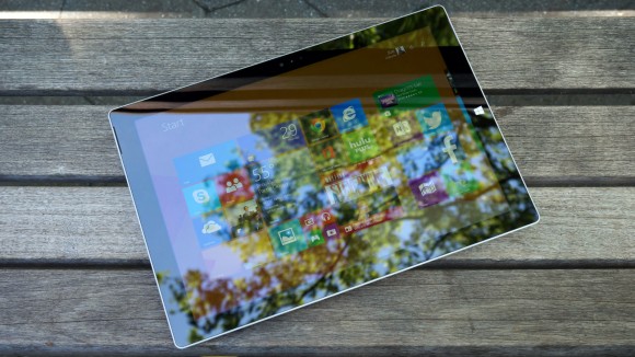
The Surface Pro 3 is closer than Microsoft has ever been to making good on that vision. After over a week with the slate, I'd go so far as to say that the Pro 3 is closer than any laptop-tablet hybrid released yet.
Microsoft was so sure of itself that not only did it directly compare the Pro 3 to Apple's iPad Air and 13-inch MacBook Air, it gave members of the press pre-release Surface Pro 3 units during an announcement event in New York. Sure, the units have bugs as of this review, but who cares? They'll be fixed in time for the June 20 launch.
"I forced the giving away of the device, just so you're aware," Surface team lead Panos Panay told me just after the reveal. "I said, 'You know what? I want the product in people's hands.' 'But the bugs are still there. They're not all done until June 20, until it's on market.' I don't care. The purity of the device is still true, and on June 20 there will be more drops."
One look at the thing might explain Panay's eagerness to get the Surface Pro 3. It's no iPad Air, that's for sure, but the iPad Air isn't packing a 12-inch display.
Design
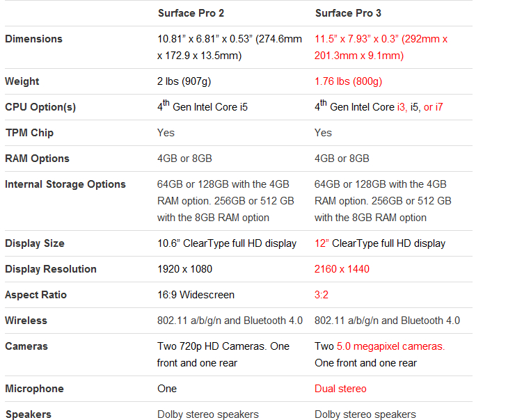
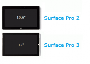
Yes, Microsoft bumped the Surface Pro touchscreen from a tiny 10.6 inches to a far roomier 12 inches. In the process, the pixel count has been upped from 1920 x 1080 to 2160 x 1440 The result is a modest boost in pixels per inch – 207 ppi to 216 ppi – given the increase in screen real estate.
More important is Microsoft's interesting choice in aspect ratio. Rather than sticking with the Pro 2's 16:9 or glomming onto the iPad's 4:9, the firm went with a 3:2 aspect ratio. The company claims that, with this aspect ratio, this 12-inch screen can actually display more content than the MacBook Air's 13.3-inch panel at 16:10. The move was also made to make the tablet feel more like your average notepad when held in portrait orientation.
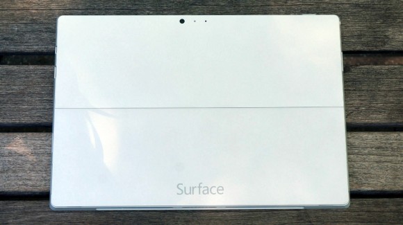
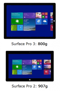
Wrapped in a bright, silver-colored magnesium shell that's cool and smooth to the touch, the Surface Pro 3 feels premium in every regard. The tablet keeps the trapezoidal shape of its predecessors, but manages to come in both thinner and lighter than before. Plus, the tablet's upper half is beset by vents on its edges to better dissipate heat pushed out by its fan.
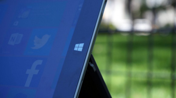
Microsoft also moved the Windows home button to the device's left side of its silky smooth – though, rather thick – glass bezel. This way, it appears on the bottom of the slate while held upright, calling out, 'Hey, hold it this way now.' While it's no doubt the lightest Surface Pro yet, I'm not sure whether I could hold onto it for an entire subway ride home.
Adorning both sides of the Pro 3 are 5MP cameras capable of 1080p video recording. While stills on either shooter won't blow you away, the front-facing lens should do just fine for Skype and the weekly video meeting over VPN.
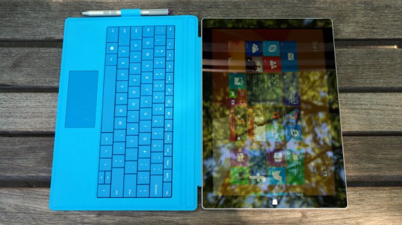
This Surface isn't without its sidekick(s)
A tablet wouldn't be much of a laptop replacement without a keyboard, and the Surface Pro keyboard was in desperate need of a boost. Luckily, Microsoft sent the Type Cover back to the drawing board, and what came back is the best version yet. From keys with deeper travel and stronger feedback to a wider glass trackpad that actually clicks, nothing was off the table.
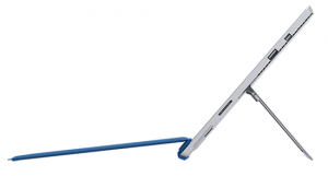
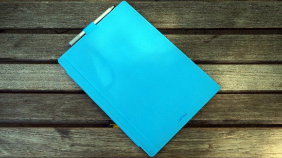
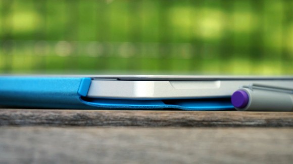
But the most important improvement is the brand new double hinge. Equipped with a strong magnet that latches onto the Pro 3's lower bezel, the Type Cover can now rest with just a portion of it touching your lap or desk. This proved to make writing on my lap much more stable than with previous Surface devices. (Plus, the plush cover comes in five colors: red, blue, cyan, black and purple.)
Tucked beside the Type Cover is also the newly improved Surface Pen. Microsoft made a point of calling its stylus that, because the firm wants it to be seen as and feel like the writing instrument we've all grown up with. With an aluminum finish and a useful clicker up top, the Surface Pen is weighted to better feel like a pen. Using Bluetooth and powered by N-trig, the stylus tracks closer to its physical position than ever before, thanks to some major improvements to the Surface screen.
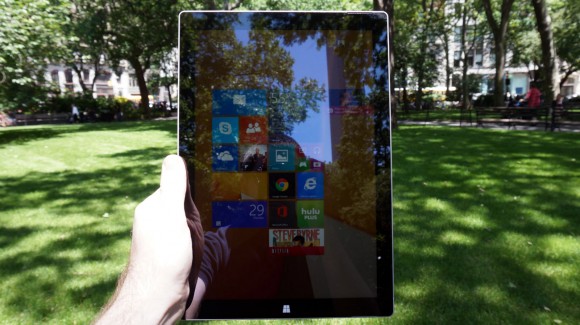
The new Surface Pro 3 inarguably has the look and feel of a premium product, so it only deserves to be stacked up against the most luxuriously built tablet and laptop around.
Specifications
The Surface Pro 3 improves upon the previous model in just about every which way – Microsoft has checked all of its boxes. The company was even so brash as to compare this hybrid of sorts to both Apple's 13-inch MacBook Air and its tablet atop the mountain, the iPad Air.
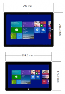
At least on the outside, the Surface Pro 3 falls somewhere smack in the middle. Measuring 7.93 x 11.5 x 0.36 inches (W x D x H), the 1.76-pound tablet isn't quite as thin and light as the iPad Air, but beats the MacBook Air in both respects easily.
And that's pretty much the point: a device that offers enough of both to replace both. The Pro 3 is a light enough tablet – but not the absolute lightest – and arguably one of the thinnest and lightest laptops around. But dimensions aren't even half of it. Does the Pro 3 offer comparable power to both, not to mention for a competitive price?
Here is the Surface Pro 3 configuration given to TechRadar:
Spec sheet
CPU: 1.9GHz Intel Core i5-4300U (dual-core, 3MB cache, up to 2.9GHz with Turbo Boost)
Graphics: Intel HD Graphics 4400
RAM: 8GB LPDDR3
Screen: 12-inch, 2160 x 1440 multi-touch (ClearType, 3:2 aspect ratio)
Storage: 256GB SSD
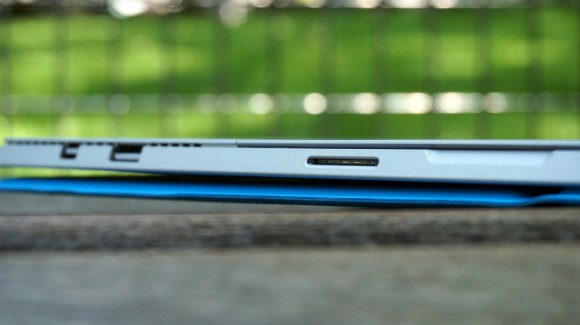
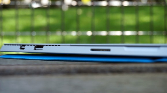
Ports: One USB 3.0, Mini DisplayPort, microSDXC card reader (up to 128GB), headphone/mic jack
Connectivity: 802.11ac Wi-Fi, Bluetooth 4.0
Camera: Two 5MP webcams (1080p HD video)
Weight: 1.76 pounds
Size: 7.93 x 11.5 x 0.36 inches (W x D x H)
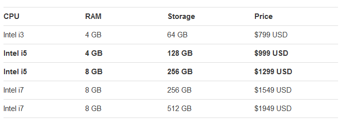
This is one of the mid-range Surface Pro 3 configurations, and it'll cost you a steep $1,299 (about £772, AU$1,403). The most affordable way into the latest Surface Pro 3 goes for just $799 (around £475, AU$863). However, you'll have to work with an Intel Core i3 chip, half as much RAM and just 64GB of storage. On the other hand, you can deck out this slate with a Core i7 CPU, 8GB of memory and a whopping 512GB solid-state drive for $1,949 (about £1,158, AU$2,106).
Returning to the device at hand, Microsoft says that it's essentially two devices in one, and has priced it accordingly, not to mention with Apple squarely in mind. So, starting with the latest iPad, it would cost $799 -- the Pro 3's starting price -- to only reach half of this Microsoft tablet's storage. And this is Apple's most premium configuration.
That price also gets you a 1.3GHz processor, a 9.7-inch display at 2048 x 1536 resolution, 802.11a/b/g/n dual-channel Wi-Fi with MIMO and Bluetooth 4.0. While it's tough to compare these displays given their difference in size, the iPad Air has a tough time competing with the Surface Pro 3 on paper.
The MacBook Air comparison is, surprisingly, an easier one to make, spec for spec. For $1,299, Apple's 13-inch thin-and-light laptop meets the Pro 3 head on in terms of storage and memory. However, that 1440 x 900 screen looks just dull in comparison. And while this notebook sports Intel's far superior HD Graphics 5000, the Core i5 chip behind them is much slower at 1.4GHz.
At first glance, it looks like the Surface Pro 3 can dance around both of Apple's machines at the same time. However, that's assuming you purchased the optional Type Cover. That's right: the one tool that enables this tablet to truly replace the laptop does not come with the device. In fact, it costs a cool $130 (around £77, AU$140). Even so, this Surface Pro 3 configuration, with Type Cover included, still costs less than Apple's entry level tablet and laptop combined. Microsoft may have made good on its goal of replacing the laptop in terms of price, but what about performance?
Performance
With a product designed to be two things at once, it's tough to quantify its performance with synthetic tests designed to typically test just one type of device. Regardless, the Surface Pro 3 performed just slightly better than the average Core i5-4200U-packing Ultrabook, which isn't terribly shocking.
Benchmarks
3DMark: Ice Storm: 30,264; Cloud Gate: 2,617; Fire Strike: 347
Cinebench CPU: 208 points; Graphics: 25.14 fps
PCMark 8 Home: 2,190 points
PCMark 8 Battery Life: 2 hours, 38 minutes
Save for PCMark's battery life test, these results are generally in line with what I would expect from a slightly beefed up Core i5 machine. This processor and RAM combo will handle video chat, streaming and perhaps the average spreadsheet VLOOKUP with ease. Plus, your lunchtime gaming breaks should go over smoothly within reason.
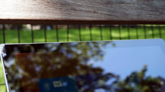
For instance, I played a round of Hearthstone with just a bit a sluggishness before I turned down the graphics detail. However, the upper right portion of the tablet's magnesium frame reached scorching levels of heat during that single session.
The same happened every time I went to watch an HD video over YouTube. Neither bode well for couch cruisers, though that redesigned hinge will come in mighty handy for this. Nothing will save this tablet from the sound its fan produces, however, which is noticeable but not disruptive or distracting.
Beaten by the battery
Back to that battery result, it frankly isn't even close to the best I've seen from a tablet. In my own use of the Pro 3 – over 10 Google Chrome tabs, Spotify streaming high bitrate audio, TweetDeck running and HipChat active with the keyboard backlit – the slate lasted 3 hours and 55 minutes. Both tests were run at max brightness on the "Balanced" power setting.
Microsoft claims that the Surface Pro 3 can hold out for up to 9 hours of web browsing before kicking the can. Considering that both PCMark 8 and my own test are plenty more strenuous than that simple task, perhaps the device could last longer under lighter loads.
Lowering the brightness will undoubtedly boost endurance, and I noticed that the tablet can last for days on standby. Regardless, this is a device meant to handle relatively heavy work loads. If it can't match the market-leading laptop in terms of longevity, then can it truly replace it?
It's true: both the 13-inch MacBook Air and iPad Air outlast the Surface Pro 3 in our tests. Under more intense loads, it wouldn't be surprising to see either maintain their lead over Microsoft's tablet. Perhaps it's Windows 8.1, or more likely that QHD screen – regardless, there's room for improvement here.
The Surface Pen points ahead
When Surface team lead Panos Panay showed off the new Surface Pen's Bluetooth feature that "magically" summoned OneNote with a click of its top button, it looked like a neat gimmick. As it turns out, that's exactly the case, but this kind of use of Bluetooth shows vast potential for the future.
At any rate, what's important here is the actual writing experience. While I personally wouldn't use the Surface Pen for much in my day-to-day work, tracking proved to be super smooth. Not to mention that the digital lines of ink were as thin as the tip of the stylus as I jotted down notes in near-perfect cursive. (Well, near-perfect in replicating my chicken scratch.)
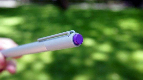
Part of this is thanks in part to that complete redesign of the N-trig powered pen, this time to better emulate the feeling of a traditional writing instrument. And while its two face buttons could be positioned lower toward the tip, they click with ease.
The other half working toward an improved pen experience is what Microsoft claims is the thinnest optical stack in the industry. (The actual optics of the screen are closer to the glass face than ever.) This helps reduce the drag between your physical position with the stylus and its digital representation. Finally, some solid solid palm rejection only enhances that notepad-like feel.
Type Cover rises up; kickstand leans back
Microsoft has upped its game in almost every way with the Surface Pro 3, but most crucial is the new and improved Type Cover. The upgrades to this accessory were essential to what Microsoft's mission to eliminate the laptop. (The improvements were so vital that keeping it an accessory was a clear misstep.)
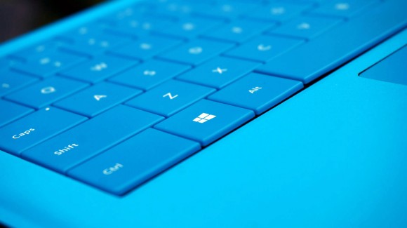
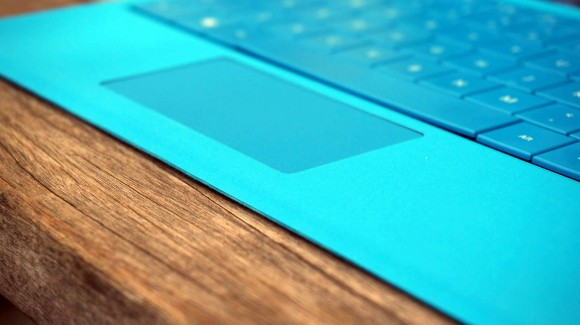
For one, the typing on this cover has been massively improved, with deeper travel and speedier, more powerful pushback than ever from the keys. The larger clickpad – yes, "clickpad" – now clicks with the force you'd expect from a laptop. Though, I did have to be rather deliberate in scrolling through web pages.
That the new Type Cover now snaps to the Pro 3's lower bezel might sound like a silly addition. But it makes for a far more sturdy and comfortable typing experience on your lap.
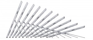
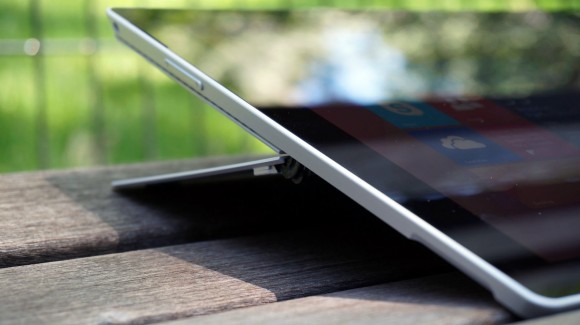
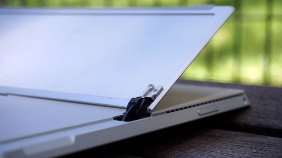
Lastly, the Redmond, Wash. company finally went and bent that kickstand nearly all the way back, allowing users to fully adjust its angle. This proved to be a boon while balancing the device on my lap for typing, as well as for just browsing my favorite websites while watching TV at the widest angle.
The hinges are incredibly stiff, requiring considerable force before they begin to give way. You should want that kind of rigidity from a device you're to use essentially for any and every computing task.
Bundled software
In addition to the standard Microsoft apps and free trials, the firm includes OneNote with every Surface Pro 3 in addition to Flipboard and Fresh Paint among a few light casual games. In short, Microsoft keeps it incredibly light on the bloatware, as it should being a first-party vendor.
The Windows Store has come a long way since its launch, but still trails behind Apple and Google's app marketplaces in terms of volume and quality. Windows 8 devices are still generally the last to receive major apps and app updates. This would be a more serious issue if the Pro 3 weren't packing Windows 8.1 Pro, but it's nevertheless a problem.
Verdict
The Surface Pro 3 is, without question, the most attractive and capable device that Microsoft has ever produced. As a result, it's not only the closest to realizing the company's vision for replacing the laptop, but closer than any hybrid device to date. This thing can honestly serve as both your tablet and laptop in nearly equal measure.
Of course, the tablet isn't without compromise. Limited app creator support, subpar battery life and a dearth of hard connections are clear hurdles for the Pro 3. Plus, leaving the much-improved Type Cover as an accessory means that this is no laptop replacement out of the box.
We liked
Everything about the Surface Pro 3 design screams style and thoughtfulness. Microsoft took the entire Surface Pro 2 back to the drawing board with this revision. Between its bigger, sharper screen and thinner, lighter magnesium frame, nearly every box has been checked in crafting a superior product.
The same goes for the Type Cover, kickstand and Surface Pen, all of which received marquee improvements and rethinks. The redesigned Type Cover has resulted in the best typing experience I've had on a tablet keyboard, while the new, wider-angle kickstand in tandem with the new stylus makes for more use cases that simply make sense.
What resulted was a device that I was reliably able to use as both a laptop and a tablet. I jumped from writing this very review to flicking cards in Hearthstone on the couch and back to writing with just a flick of the kickstand and a snap of the keyboard cover. If that's not a measure of a all-in-one device, I don't know what is.
We disliked
But make no mistake, there is still room for improvement with the Surface Pro 3. For one, selling the Type Cover as an optional accessory not only inflates the price of this product, but only serves to diminish Microsoft's mission statement to replace the laptop.
Another knock against the tablet is that it's quite quick to burn up. Whether it was an HD video over Netflix or YouTube, a casual game or even system updates, the upper right portion of the metallic shell would grow almost uncomfortable to hold. Thankfully for the kickstand, there are many situations in which you need to hold the slate while sitting.
Finally, just under 4 hours of battery life might be suitable for the average Ultrabook, but not for your everyday tablet. And for Microsoft to position the Surface Pro 3 against the iPad Air and 13-inch MacBook Air, which both set the endurance standards in their categories, only makes this point look worse.
Final verdict
It's worth reiterating the point that the Surface Pro 3 is not only Microsoft's most striking and versatile device to date, but the most convincing poster child for the hybrid category yet. And this ringing endorsement comes from a long-time skeptic of such devices.
That said, the Pro 3 is hamstrung by flaws that cannot be ignored. Namely, the battery life might be in line with most Ultrabooks, but it doesn't come close to what Apple's leading laptop and top tablet have shown. And the Type Cover being billed as an accessory doesn't help Microsoft's cause in the slightest – it's quite pricey to boot.
At any rate, this version of the tablet comes in cheaper than the most affordable iPad Air and 13-inch MacBook Air combined, even with the Type Cover, and that's the point. On paper, this slate is more powerful than either Apple device, not to mention most other comparably priced laptops and tablets. The Surface Pro 3 might not be perfect, but it's far and wide the brightest shining example of a potential tablet takeover.
From: http://www.techradar.com/us/reviews/pc-mac/tablets/microsoft-surface-pro-3-1249750/review/
Knock it for the Windows 8 launch. Lay into it for how it debuted the Xbox One. But, when it comes to its latest product, the Surface Pro 3, don't pull out the torches and pitchforks just yet – Microsoft is onto something here.

The company has been hammering away at what it considers is a problem with tablets for years. Since the launch of the Surface Pro, Microsoft has sought after the ultimate mobile computing device, one that could replace the laptop with a tablet-first approach.

The Surface Pro 3 is closer than Microsoft has ever been to making good on that vision. After over a week with the slate, I'd go so far as to say that the Pro 3 is closer than any laptop-tablet hybrid released yet.
Microsoft was so sure of itself that not only did it directly compare the Pro 3 to Apple's iPad Air and 13-inch MacBook Air, it gave members of the press pre-release Surface Pro 3 units during an announcement event in New York. Sure, the units have bugs as of this review, but who cares? They'll be fixed in time for the June 20 launch.
"I forced the giving away of the device, just so you're aware," Surface team lead Panos Panay told me just after the reveal. "I said, 'You know what? I want the product in people's hands.' 'But the bugs are still there. They're not all done until June 20, until it's on market.' I don't care. The purity of the device is still true, and on June 20 there will be more drops."

One look at the thing might explain Panay's eagerness to get the Surface Pro 3. It's no iPad Air, that's for sure, but the iPad Air isn't packing a 12-inch display.
Design
Yes, Microsoft bumped the Surface Pro touchscreen from a tiny 10.6 inches to a far roomier 12 inches. In the process, the pixel count has been upped from 1920 x 1080 to 2160 x 1440 The result is a modest boost in pixels per inch – 207 ppi to 216 ppi – given the increase in screen real estate.
More important is Microsoft's interesting choice in aspect ratio. Rather than sticking with the Pro 2's 16:9 or glomming onto the iPad's 4:9, the firm went with a 3:2 aspect ratio. The company claims that, with this aspect ratio, this 12-inch screen can actually display more content than the MacBook Air's 13.3-inch panel at 16:10. The move was also made to make the tablet feel more like your average notepad when held in portrait orientation.

Wrapped in a bright, silver-colored magnesium shell that's cool and smooth to the touch, the Surface Pro 3 feels premium in every regard. The tablet keeps the trapezoidal shape of its predecessors, but manages to come in both thinner and lighter than before. Plus, the tablet's upper half is beset by vents on its edges to better dissipate heat pushed out by its fan.
Microsoft also moved the Windows home button to the device's left side of its silky smooth – though, rather thick – glass bezel. This way, it appears on the bottom of the slate while held upright, calling out, 'Hey, hold it this way now.' While it's no doubt the lightest Surface Pro yet, I'm not sure whether I could hold onto it for an entire subway ride home.
Adorning both sides of the Pro 3 are 5MP cameras capable of 1080p video recording. While stills on either shooter won't blow you away, the front-facing lens should do just fine for Skype and the weekly video meeting over VPN.

This Surface isn't without its sidekick(s)
A tablet wouldn't be much of a laptop replacement without a keyboard, and the Surface Pro keyboard was in desperate need of a boost. Luckily, Microsoft sent the Type Cover back to the drawing board, and what came back is the best version yet. From keys with deeper travel and stronger feedback to a wider glass trackpad that actually clicks, nothing was off the table.
But the most important improvement is the brand new double hinge. Equipped with a strong magnet that latches onto the Pro 3's lower bezel, the Type Cover can now rest with just a portion of it touching your lap or desk. This proved to make writing on my lap much more stable than with previous Surface devices. (Plus, the plush cover comes in five colors: red, blue, cyan, black and purple.)
Tucked beside the Type Cover is also the newly improved Surface Pen. Microsoft made a point of calling its stylus that, because the firm wants it to be seen as and feel like the writing instrument we've all grown up with. With an aluminum finish and a useful clicker up top, the Surface Pen is weighted to better feel like a pen. Using Bluetooth and powered by N-trig, the stylus tracks closer to its physical position than ever before, thanks to some major improvements to the Surface screen.

The new Surface Pro 3 inarguably has the look and feel of a premium product, so it only deserves to be stacked up against the most luxuriously built tablet and laptop around.
Specifications
The Surface Pro 3 improves upon the previous model in just about every which way – Microsoft has checked all of its boxes. The company was even so brash as to compare this hybrid of sorts to both Apple's 13-inch MacBook Air and its tablet atop the mountain, the iPad Air.
At least on the outside, the Surface Pro 3 falls somewhere smack in the middle. Measuring 7.93 x 11.5 x 0.36 inches (W x D x H), the 1.76-pound tablet isn't quite as thin and light as the iPad Air, but beats the MacBook Air in both respects easily.
And that's pretty much the point: a device that offers enough of both to replace both. The Pro 3 is a light enough tablet – but not the absolute lightest – and arguably one of the thinnest and lightest laptops around. But dimensions aren't even half of it. Does the Pro 3 offer comparable power to both, not to mention for a competitive price?

Here is the Surface Pro 3 configuration given to TechRadar:
Spec sheet
CPU: 1.9GHz Intel Core i5-4300U (dual-core, 3MB cache, up to 2.9GHz with Turbo Boost)
Graphics: Intel HD Graphics 4400
RAM: 8GB LPDDR3
Screen: 12-inch, 2160 x 1440 multi-touch (ClearType, 3:2 aspect ratio)
Storage: 256GB SSD
Ports: One USB 3.0, Mini DisplayPort, microSDXC card reader (up to 128GB), headphone/mic jack
Connectivity: 802.11ac Wi-Fi, Bluetooth 4.0
Camera: Two 5MP webcams (1080p HD video)
Weight: 1.76 pounds
Size: 7.93 x 11.5 x 0.36 inches (W x D x H)
This is one of the mid-range Surface Pro 3 configurations, and it'll cost you a steep $1,299 (about £772, AU$1,403). The most affordable way into the latest Surface Pro 3 goes for just $799 (around £475, AU$863). However, you'll have to work with an Intel Core i3 chip, half as much RAM and just 64GB of storage. On the other hand, you can deck out this slate with a Core i7 CPU, 8GB of memory and a whopping 512GB solid-state drive for $1,949 (about £1,158, AU$2,106).

Returning to the device at hand, Microsoft says that it's essentially two devices in one, and has priced it accordingly, not to mention with Apple squarely in mind. So, starting with the latest iPad, it would cost $799 -- the Pro 3's starting price -- to only reach half of this Microsoft tablet's storage. And this is Apple's most premium configuration.
That price also gets you a 1.3GHz processor, a 9.7-inch display at 2048 x 1536 resolution, 802.11a/b/g/n dual-channel Wi-Fi with MIMO and Bluetooth 4.0. While it's tough to compare these displays given their difference in size, the iPad Air has a tough time competing with the Surface Pro 3 on paper.
The MacBook Air comparison is, surprisingly, an easier one to make, spec for spec. For $1,299, Apple's 13-inch thin-and-light laptop meets the Pro 3 head on in terms of storage and memory. However, that 1440 x 900 screen looks just dull in comparison. And while this notebook sports Intel's far superior HD Graphics 5000, the Core i5 chip behind them is much slower at 1.4GHz.

At first glance, it looks like the Surface Pro 3 can dance around both of Apple's machines at the same time. However, that's assuming you purchased the optional Type Cover. That's right: the one tool that enables this tablet to truly replace the laptop does not come with the device. In fact, it costs a cool $130 (around £77, AU$140). Even so, this Surface Pro 3 configuration, with Type Cover included, still costs less than Apple's entry level tablet and laptop combined. Microsoft may have made good on its goal of replacing the laptop in terms of price, but what about performance?
Performance
With a product designed to be two things at once, it's tough to quantify its performance with synthetic tests designed to typically test just one type of device. Regardless, the Surface Pro 3 performed just slightly better than the average Core i5-4200U-packing Ultrabook, which isn't terribly shocking.
Benchmarks
3DMark: Ice Storm: 30,264; Cloud Gate: 2,617; Fire Strike: 347
Cinebench CPU: 208 points; Graphics: 25.14 fps
PCMark 8 Home: 2,190 points
PCMark 8 Battery Life: 2 hours, 38 minutes
Save for PCMark's battery life test, these results are generally in line with what I would expect from a slightly beefed up Core i5 machine. This processor and RAM combo will handle video chat, streaming and perhaps the average spreadsheet VLOOKUP with ease. Plus, your lunchtime gaming breaks should go over smoothly within reason.

For instance, I played a round of Hearthstone with just a bit a sluggishness before I turned down the graphics detail. However, the upper right portion of the tablet's magnesium frame reached scorching levels of heat during that single session.
The same happened every time I went to watch an HD video over YouTube. Neither bode well for couch cruisers, though that redesigned hinge will come in mighty handy for this. Nothing will save this tablet from the sound its fan produces, however, which is noticeable but not disruptive or distracting.
Beaten by the battery
Back to that battery result, it frankly isn't even close to the best I've seen from a tablet. In my own use of the Pro 3 – over 10 Google Chrome tabs, Spotify streaming high bitrate audio, TweetDeck running and HipChat active with the keyboard backlit – the slate lasted 3 hours and 55 minutes. Both tests were run at max brightness on the "Balanced" power setting.

Microsoft claims that the Surface Pro 3 can hold out for up to 9 hours of web browsing before kicking the can. Considering that both PCMark 8 and my own test are plenty more strenuous than that simple task, perhaps the device could last longer under lighter loads.
Lowering the brightness will undoubtedly boost endurance, and I noticed that the tablet can last for days on standby. Regardless, this is a device meant to handle relatively heavy work loads. If it can't match the market-leading laptop in terms of longevity, then can it truly replace it?

It's true: both the 13-inch MacBook Air and iPad Air outlast the Surface Pro 3 in our tests. Under more intense loads, it wouldn't be surprising to see either maintain their lead over Microsoft's tablet. Perhaps it's Windows 8.1, or more likely that QHD screen – regardless, there's room for improvement here.
The Surface Pen points ahead
When Surface team lead Panos Panay showed off the new Surface Pen's Bluetooth feature that "magically" summoned OneNote with a click of its top button, it looked like a neat gimmick. As it turns out, that's exactly the case, but this kind of use of Bluetooth shows vast potential for the future.
At any rate, what's important here is the actual writing experience. While I personally wouldn't use the Surface Pen for much in my day-to-day work, tracking proved to be super smooth. Not to mention that the digital lines of ink were as thin as the tip of the stylus as I jotted down notes in near-perfect cursive. (Well, near-perfect in replicating my chicken scratch.)

Part of this is thanks in part to that complete redesign of the N-trig powered pen, this time to better emulate the feeling of a traditional writing instrument. And while its two face buttons could be positioned lower toward the tip, they click with ease.
The other half working toward an improved pen experience is what Microsoft claims is the thinnest optical stack in the industry. (The actual optics of the screen are closer to the glass face than ever.) This helps reduce the drag between your physical position with the stylus and its digital representation. Finally, some solid solid palm rejection only enhances that notepad-like feel.
Type Cover rises up; kickstand leans back
Microsoft has upped its game in almost every way with the Surface Pro 3, but most crucial is the new and improved Type Cover. The upgrades to this accessory were essential to what Microsoft's mission to eliminate the laptop. (The improvements were so vital that keeping it an accessory was a clear misstep.)

For one, the typing on this cover has been massively improved, with deeper travel and speedier, more powerful pushback than ever from the keys. The larger clickpad – yes, "clickpad" – now clicks with the force you'd expect from a laptop. Though, I did have to be rather deliberate in scrolling through web pages.
That the new Type Cover now snaps to the Pro 3's lower bezel might sound like a silly addition. But it makes for a far more sturdy and comfortable typing experience on your lap.

Lastly, the Redmond, Wash. company finally went and bent that kickstand nearly all the way back, allowing users to fully adjust its angle. This proved to be a boon while balancing the device on my lap for typing, as well as for just browsing my favorite websites while watching TV at the widest angle.
The hinges are incredibly stiff, requiring considerable force before they begin to give way. You should want that kind of rigidity from a device you're to use essentially for any and every computing task.

Bundled software
In addition to the standard Microsoft apps and free trials, the firm includes OneNote with every Surface Pro 3 in addition to Flipboard and Fresh Paint among a few light casual games. In short, Microsoft keeps it incredibly light on the bloatware, as it should being a first-party vendor.
The Windows Store has come a long way since its launch, but still trails behind Apple and Google's app marketplaces in terms of volume and quality. Windows 8 devices are still generally the last to receive major apps and app updates. This would be a more serious issue if the Pro 3 weren't packing Windows 8.1 Pro, but it's nevertheless a problem.
Verdict
The Surface Pro 3 is, without question, the most attractive and capable device that Microsoft has ever produced. As a result, it's not only the closest to realizing the company's vision for replacing the laptop, but closer than any hybrid device to date. This thing can honestly serve as both your tablet and laptop in nearly equal measure.
Of course, the tablet isn't without compromise. Limited app creator support, subpar battery life and a dearth of hard connections are clear hurdles for the Pro 3. Plus, leaving the much-improved Type Cover as an accessory means that this is no laptop replacement out of the box.
We liked
Everything about the Surface Pro 3 design screams style and thoughtfulness. Microsoft took the entire Surface Pro 2 back to the drawing board with this revision. Between its bigger, sharper screen and thinner, lighter magnesium frame, nearly every box has been checked in crafting a superior product.
The same goes for the Type Cover, kickstand and Surface Pen, all of which received marquee improvements and rethinks. The redesigned Type Cover has resulted in the best typing experience I've had on a tablet keyboard, while the new, wider-angle kickstand in tandem with the new stylus makes for more use cases that simply make sense.
What resulted was a device that I was reliably able to use as both a laptop and a tablet. I jumped from writing this very review to flicking cards in Hearthstone on the couch and back to writing with just a flick of the kickstand and a snap of the keyboard cover. If that's not a measure of a all-in-one device, I don't know what is.
We disliked
But make no mistake, there is still room for improvement with the Surface Pro 3. For one, selling the Type Cover as an optional accessory not only inflates the price of this product, but only serves to diminish Microsoft's mission statement to replace the laptop.
Another knock against the tablet is that it's quite quick to burn up. Whether it was an HD video over Netflix or YouTube, a casual game or even system updates, the upper right portion of the metallic shell would grow almost uncomfortable to hold. Thankfully for the kickstand, there are many situations in which you need to hold the slate while sitting.
Finally, just under 4 hours of battery life might be suitable for the average Ultrabook, but not for your everyday tablet. And for Microsoft to position the Surface Pro 3 against the iPad Air and 13-inch MacBook Air, which both set the endurance standards in their categories, only makes this point look worse.
Final verdict
It's worth reiterating the point that the Surface Pro 3 is not only Microsoft's most striking and versatile device to date, but the most convincing poster child for the hybrid category yet. And this ringing endorsement comes from a long-time skeptic of such devices.
That said, the Pro 3 is hamstrung by flaws that cannot be ignored. Namely, the battery life might be in line with most Ultrabooks, but it doesn't come close to what Apple's leading laptop and top tablet have shown. And the Type Cover being billed as an accessory doesn't help Microsoft's cause in the slightest – it's quite pricey to boot.
At any rate, this version of the tablet comes in cheaper than the most affordable iPad Air and 13-inch MacBook Air combined, even with the Type Cover, and that's the point. On paper, this slate is more powerful than either Apple device, not to mention most other comparably priced laptops and tablets. The Surface Pro 3 might not be perfect, but it's far and wide the brightest shining example of a potential tablet takeover.
From: http://www.techradar.com/us/reviews/pc-mac/tablets/microsoft-surface-pro-3-1249750/review/

